My Visualization Tutorial
In this blog post, I will explain how to construct an interesting data visualization of the Palmer Penguins data set.
Getting data
We will utilize pandas for data frame manipulation, and seaborn for pretty visualizations.
import pandas as pd
import seaborn as sns
We will directly get and store the Palmer Penguin data set from Prof. Chodrow’s Github page.
url = "https://raw.githubusercontent.com/PhilChodrow/PIC16B/master/datasets/palmer_penguins.csv"
penguins = pd.read_csv(url)
Data Manipulation
The original data frame lists the penguins’ species names like so:
- Adelie Penguin (Pygoscelis adeliae)
- Chinstrap penguin (Pygoscelis antarctica)
- Gentoo penguin (Pygoscelis papua)
We will remove the scientific names so that they do not make the legends of our visualizations too clustered. We do so by first splitting each name by space, then taking only the 1st component of each name. This will remove the redundant “[Pp]enguin” and the scientific names following Species names.
# Shortening the species names to Adelie, Chinstrap, and Gentoo.
penguins["Species"] = penguins["Species"].str.split().str[0]
Data Visualization
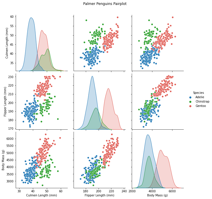
We will select only four columns from the data set for plotting: “Culmen Length (mm)”, “Flipper Length (mm)”, “Body Mass (g)” and “Species”.
Here we will use pairplot, which is convenient for showing potential interactions between multiple variable columns by creating a grid of plots.
In this example, we pass in three numeric columns, therefore a 3 by 3 grid is created for plotting. The non-diagonals show scatter plots and the diagonals show the univariate marginal distribution. We specify the qualitative/categorical column “Species” as the hue argument, thereby coloring each penguin data points by its Species, with the legend showing what each color corresponds to.
# The four columns that will be used in the visualization
cols = ['Culmen Length (mm)', 'Flipper Length (mm)',
        'Body Mass (g)', "Species"]
# Plotting pairplot with custom color palette for species
sns.pairplot(penguins[cols], hue = "Species", height = 3,
             palette = {"Adelie":"#1f77b5",
                        "Chinstrap":"#2ba02b",
                        "Gentoo":"#e05c54"}
            )